Understand the functionality and aesthetics of graphic design by making LOST and FOUND poster for customers.
Customers: My cat is lost; please help me make a LOST AND FOUND poster.
Designer: Ok
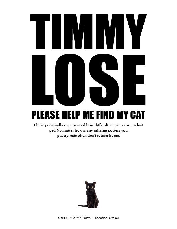 first version
Customers: The cat is too small. Can you make it bigger?
Designer: Ok

second vision
Customers: I’m not asking you to make it so big; I want the cat to be bigger than the first and smaller than the second.
Designer: Ok
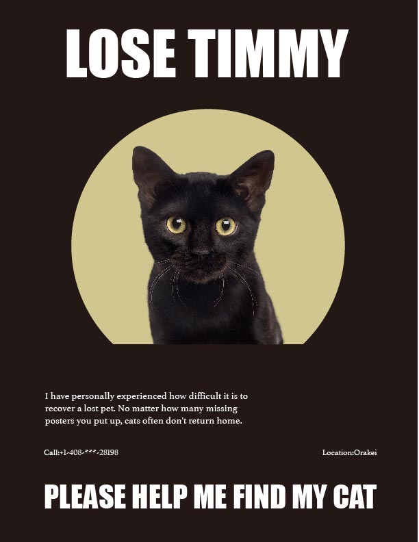 third vision
Customers: Can you give me a vision with a complete picture of my cat?
Can you design colored ones?
Can you……………
After dozens of design
Customers: I like this one

final vision
With a red and yellow highly saturated color scheme, passers-by can see all the main points within 100 miles and understand all the information within a second. Using the independent style, the contact information can be locked more quickly without being disturbed.
——This story comes from a senior graphic designer.
Which is more important in design, aesthetics or functionality?
Although business pays more attention to practicality, the essence of graphic design is not just to solve visual problems. Judging whether a design is suitable depends on the purpose itself. You wouldn’t find Apple’s website design very practical, but it communicates tone,
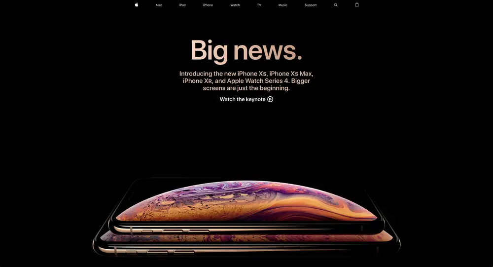
just as you wouldn’t find the mascot of the World Expo in Japan beautiful but eye-catching.
 It would be boring if there were only functionality left in life.
Finding Balance
The balance of function and aesthetics is becoming more and more critical. With the rapid evolution of technology, people are becoming more expecting instant gratification–and that definitely carries over to design. Face value is more crucial than ever, and the aesthetic entirely controls what the brand portrays. However, having a finely-crafted aesthetic can only grab the viewer’s attention. It is up to the function to provide the information clearly and concisely.